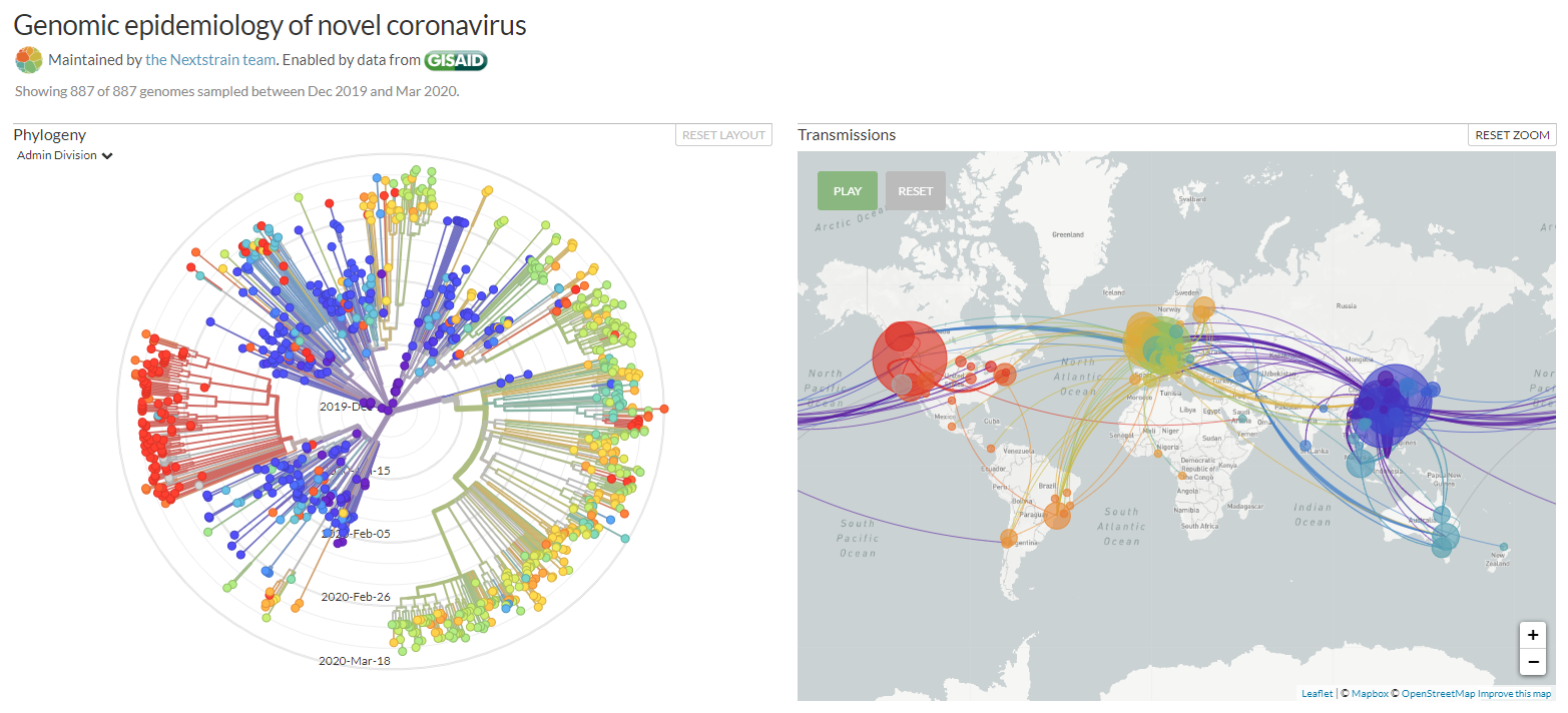
Figure shows a screenshot of the Genomic epidemiology of novel coronavirus. Maintained by the Nextstrain team. Enabled by data from GISAID. Showing 955 of 955 genomes sampled between Dec 2019 and Mar 2020.
Earlier we shared a Coronavirus vs Influenza Table listing the differences between the coronavirus and the flu. The numbers in the table are updated continuously as new data is reported by reputable organizations such as the World Health organization (WHO) and Center for Disease Control (CDC) of countries that are funding and managing them well. Here we offer a list of the most informative, most helpful, and best-designed online visualizations of the coronavirus pandemic.
Latest List Update: December 6 2020
These Coronavirus SARS-CoV-2 web sites offer different types of statistics and visualizations:
Read more